Project Tour: Project Alexandra, Adding a Loft Extension Nearly Doubled This Property's Space
Back in December 2022 we found ourselves the owners of a run-down first floor maisonette in North London.
The architecture: 1900’s. The style: 1980’s.
I had been looking for a new project for a while, and the intention behind this one was to either rent it out or sell it after the works were completed, or perhaps even move in, as our daughter was starting secondary school soon, and the school nearest was very sought after.
Before:
It had been a while since I’d taken on a project of our own, except for client renovations, we hadn’t taken on anything since we completed our self-build in 2018, so I was excited to tackle this one.
This property had huge potential. It had good Victorian bones with a bit of ‘nothing is quite straight’ charm, and was in a good area with great schools. The maisonette started off as two bedroomed, although the second bedroom was tiny at around 4 metres square, all the other rooms were substantial sizes and the main reason we purchased it was because it had a huge loft space – and other properties on the street had not only extended into the loft space, but also added an additional dormer. So the potential was there to not only almost double the square footage of the home, but also to add a new rear access external staircase to the garden, greatly improving the space usage and flow of the existing layout
The Layout
Floor plans are my favourite thing! Nothing pleases me more than sitting with a floorplan for hours and playing around and imagining what a space can become. So I set to work, exploring every single iteration and variation of what could be achieved with the space, and landed on the final layout – a spacious 3 bedroom, 1 office, 2 bathroom family maisonette, with a light-filled, spacious kitchen diner fit for big family get-togethers, and with new direct access to the rear garden via a newly constructed steel staircase. Bringing light into a property is always top of my list, and here I achieved that mostly with rooflights, one installed above the kitchen, another above the new landing on the loft floor, two large Veluxes, and a small, but effective skylight above the shower in the family bathroom.
Comparing this layout to the other planning applications on the street, I could see that no-one had yet managed to arrange the space well enough to achieve 2 double bedrooms, 2 bathrooms (one an en-suite) as well as a light filled stairway and landing – my hours of layout planning had paid off, and I knew I was onto a winning layout.
The garden at this property was initially accessed via a very old-fashioned (and somewhat creepy!) hatch in the kitchen floor, and although it was quite narrow, it was really long at nearly 18 metres, so as and extra bonus, I also decided to include a garden office with electricity, and shed storage combo at the end of the garden as an additional rental or selling point.
I had to be very mindful of budget, especially as this was to be a flip or a rental. Over the past few years I’ve seen build costs and material costs skyrocket, so from design to finishes – I planned this renovation meticulously, although you can never know what surprises lie behind those Victorian lath and plaster walls – as we were to find out!
The proposed floor plans show just how drastically the space could be improved for family living
The Planning
On this project I decided to take on the planning application process myself, I drew up the existing and proposed floorplans, and we were granted planning permission in February 2023, I then enlisted the helpful team at The Architects, headed up by Ivan Henshell, to help with the construction drawings and structural aspects.
The Build
The tender process took a while – as it always does! A few months in this case, but by September 2023 we were ready for the exciting demo stage and our chosen builders, Gesti Builders moved in.
During demo and construction phase we uncovered three big issues which pushed the budget, first, we discovered that all the existing electrics had to be replaced which we weren’t expecting. The old system was not safe to connect to the new electrics being installed on the new loft floor, it was an easy decision on this one, safety always comes first, so I decided to give the go-ahead to remove all the existing electrics, and have a completely new wiring installed throughout the entire property.
Secondly, we found out that some of the stud walls had never been properly built and secured, and in order to have a safe and secure structure to support the new floor above, three stud walls had to be removed and rebuilt.
And thirdly, it was the roof, a biggie. The existing roof tiles were acceptable, and there were no apparent leaks, but the membrane directly underneath was nearly as old as the house itself, and had some tears in it, we could have left it as it was, but to me it didn’t make sense to leave a broken membrane within a property that would be otherwise almost completely new and renovated from back-to brick.
Also if there were any issues with the roof in future, the work would have to be re-done anyway, so I made the (expensive!) decision to replace the membrane, which involved removing all the roof tiles and battens before the work could be carried out, adding significant time and money onto the project.
But it was the decision we felt most comfortable with, whether we rented or sold, it made sense. If we’d let it out, we definitely did not want to deal with roof repairs while tenants were in the property, or if we sold it, I would feel extremely worried that the new owners may have leaks and have concerns that we had not done all the works responsibly, so the decision was easy in the end.
Once all the issues were resolved the project ran extremely smoothly, but as I always say – if you put in the hours to plan at the start, it all pays off during the renovation process. Once all the structural issues were resolved, we moved through the first fix, second fix and finish stages pretty quickly.
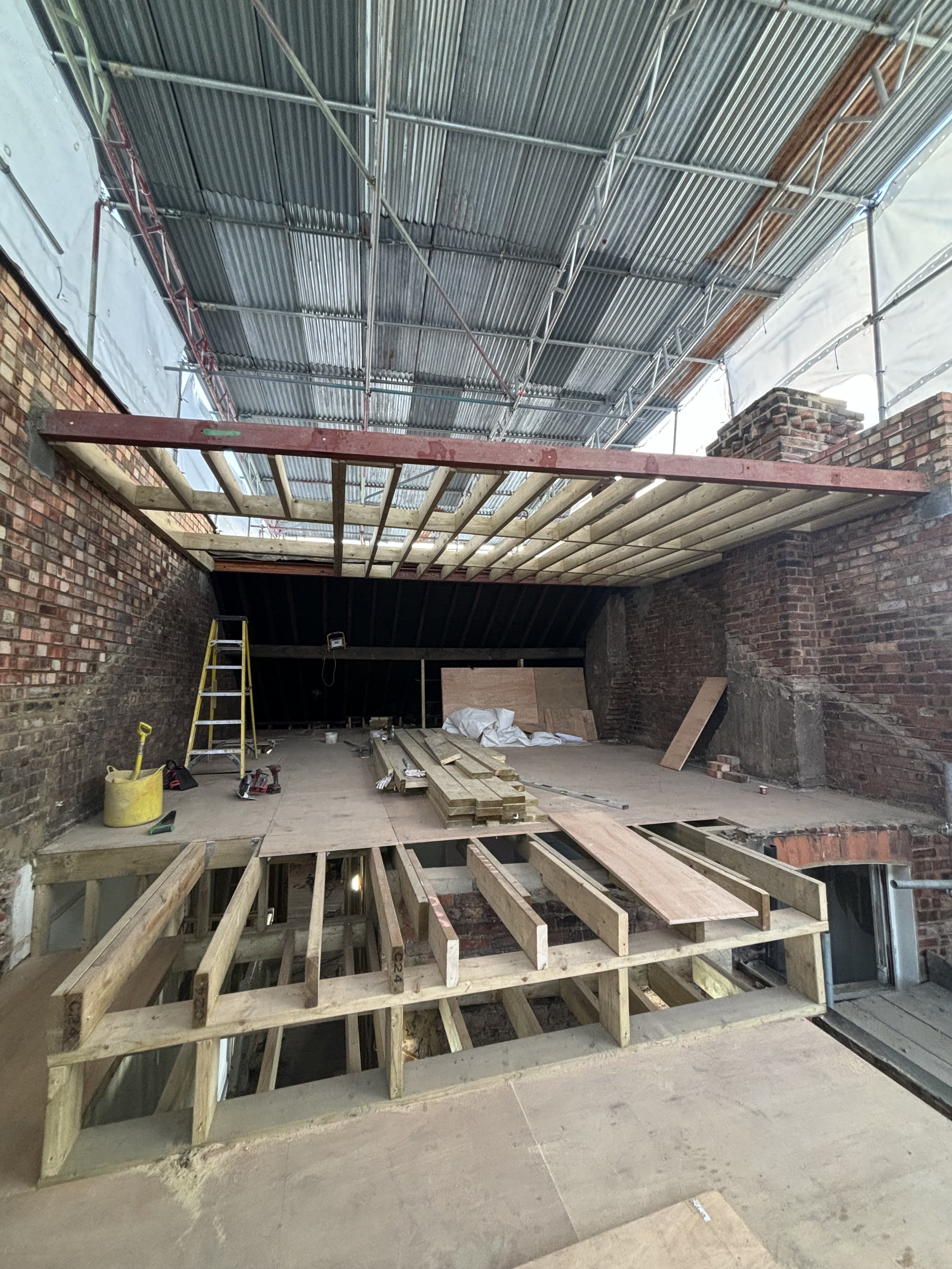
The beginings of the new loft floor being constructed
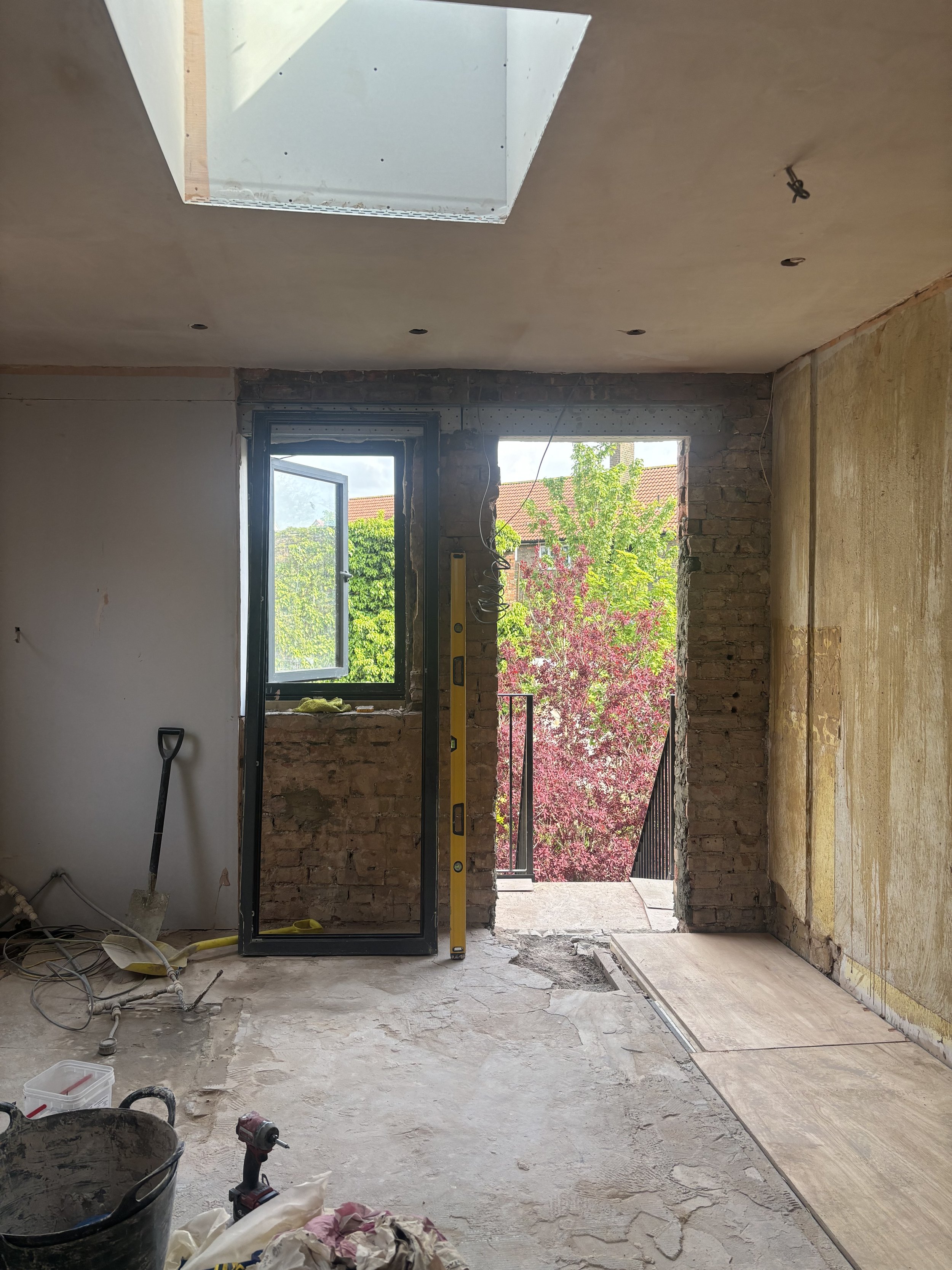
The new access opening to the garden not only freed up over 2m square floorspace in the kitchen, but also brought in even more light
The Interior
I had to be very considered with the interiors on this project. I wanted it to be clean, classy, and neutral, but not SO neutral so as to be boring! It still needed to have personality, so that a young family could picture themselves living there.
Also, this was a Victorian property with some beautiful original features still in place, like the two fireplaces with original tiling and the wooden sash windows, and I really wanted to work with those and re-introduce some elements that would accentuate this period home.
The maisonette needed to appeal to family living, the new layout provided 4 rooms that could be used as bedrooms, and it was in catchment for some excellent primary and secondary schools, so my target audience was very clear.
I settled on a palette of materials and colours including wood, brass, brushed nickel, tones of green and classic black and white that would appeal to a young family, and chose finishes that would hold up well under the pressures of busy family life.
Despite the budget being a bit battered by the unexpected electrical, roof and structural surprises, there are some things that I never compromise on when it comes to internal finishes, these are usually flooring, worktops and taps.
The now bright and light hallway with the old, dusty carpet removed and much more practical engineered oak floors.
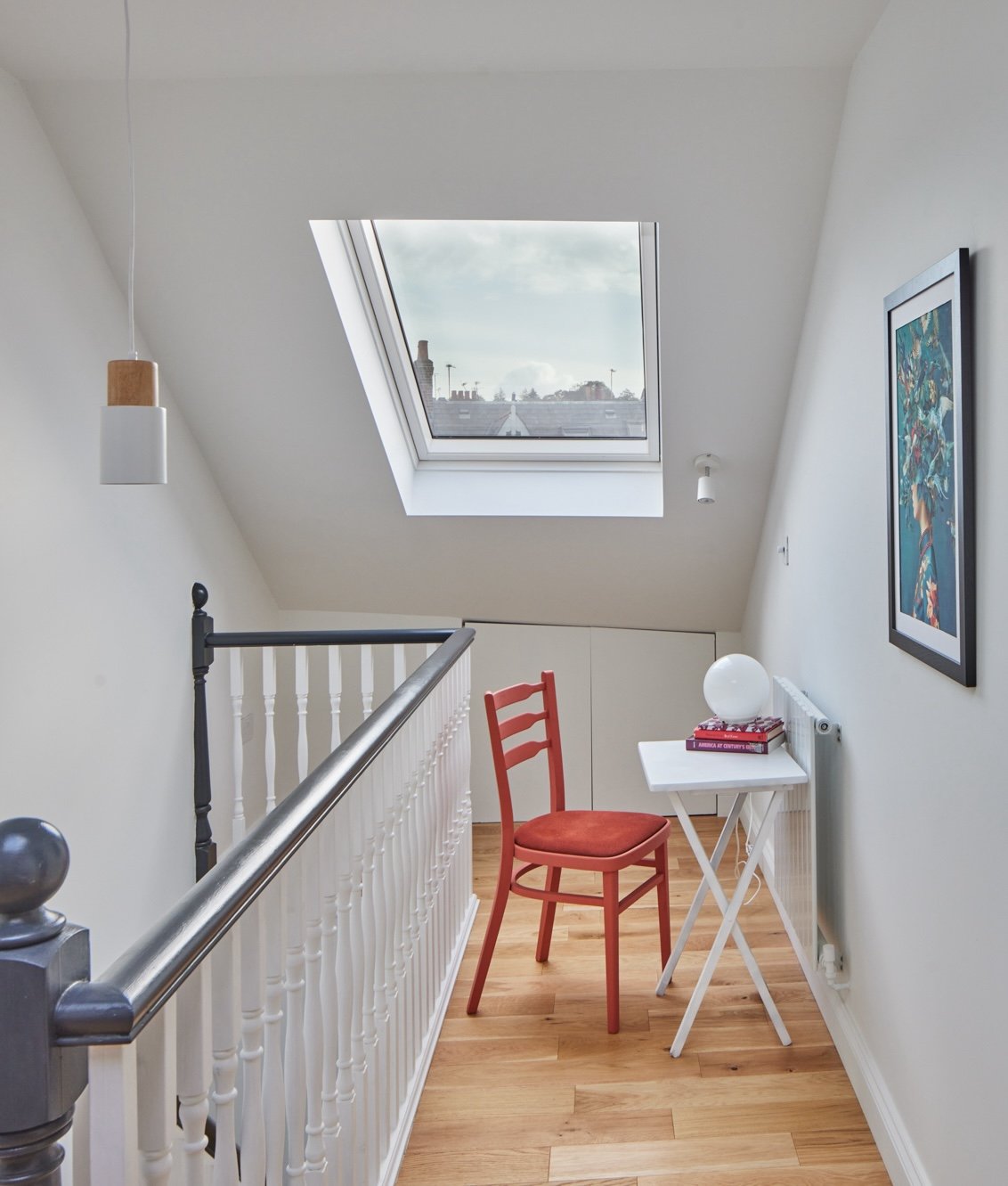
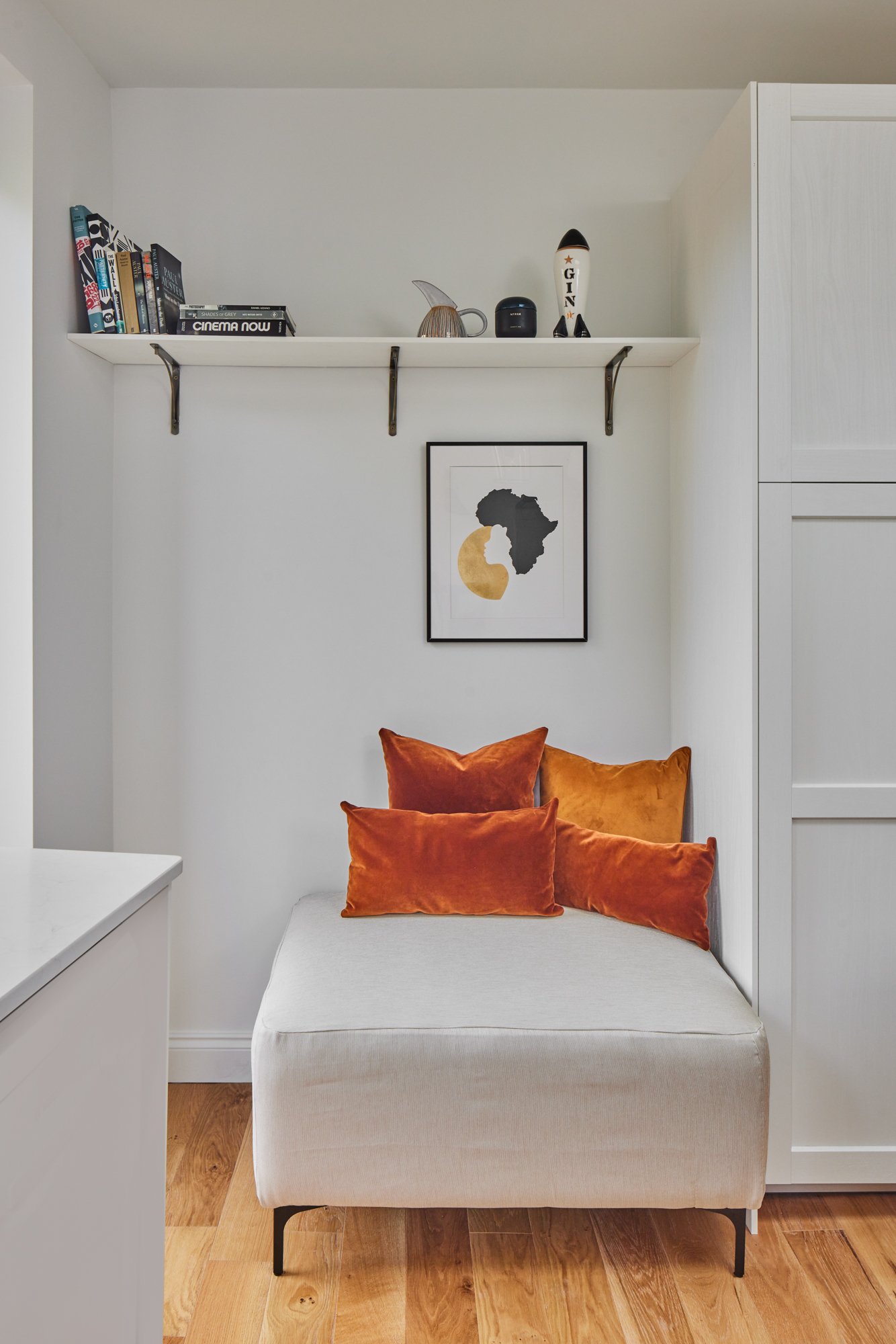
This is the brand new landing on the new loft floor, I could have closed this off and made the main bedroom larger, but designing it this way instead allowed for more light and space in the transition areas, giving this apartment the feel of a house rather than a boxy, dark flat - a huge selling point. The chair painted in Francesca’s Paints’ Sun-dried Tomato adds a playful burst of colour in this bright space that can also be used as an office area.
For the flooring I sourced engineered oak finished in a warm tone which I used throughout the property, except in the bathrooms, and where noise to the downstairs neighbours might be an issue, although I did spec a premium noise-reducing underlay and sub-floor where the engineered wood was installed as well. In the kitchen, the budget had to be adjusted for the cabinetry to accommodate for the overspend on the roof, so I went with flat-pack cabinets, but upgraded it with gorgeous quartz worktops, waterfalling the island on both sides, adding a really luxe feel. In all the bathrooms I sourced taps and showers that I absolutely loved! With a subtle nod to the traditional Victorian style, but still feel modern and minimal at the same time, I was so happy with this choice.
The family bathroom is practical but beautiful with Onyx style tiles and traditional cabinetry - and those brushed nickel taps! I just love the way the shower head arm curved up into the little skylight above. My usual trick of using a combo of tile and paint not only saves on tile and labour costs, but I think it also makes bathrooms feel warmer and a little less clinical than tiling all the way up to the ceiling.
Another area I pay really close attention to when designing, are the tile choices, here I wanted to create a touch of luxury in the main en-suite, a retreat for the parents after a busy day of work and family life! So I settled on a stunning porcelain faux marble effect large format tile for the shower and a tactile hand-made zellige tile for the back splash, I also added integrated lighting in the shower niche for a relaxing spa-like feel.
In the family bathroom I selected a matt porcelain in a mix of greens that make up the effect of real onyx and spent on beautiful built-in cabinetry for storage, but also to add to that Victorian charm.
The vanity area in the en-suite is one of my favourite little areas! I had to work hard to make this small room feel light and spacious, this wasn’t the original spot planned for the vanity, but when I saw it, it looked perfect - so I asked the builders to make this nook wide enough to accommodate the off-the-shelf unit - the plumbing wasn’t yet installed at that stage, so the change was easy.
The large format porcelain tiles in the en-suite shower are so luxurious work really well with brass finish on the taps, and I always include some integrated lighting in a bathroom!
I loved designing the kitchen diner in this property, it has been completely transformed. It was already a good size before the reno, but to make it even more impressive and functional for family life, I stole some space from the adjoining original bathroom which was now a guest wc – as there were two new bathrooms on the new floor upstairs.
Light now floods into the space thanks to the new one metre square roof light above the island and the glazed door to the new balcony and steel staircase down to the garden.
We considered removing the chimney breast in this room, but with the budget over-runs, we decided against it, so instead I created a feature of it by opening it up (and discovering an original metal stove!) and sourcing a reclaimed fireplace surround and creating a cosy little seating area withing the kitchen. I stuck to classic black and white in this room, also painting the original wooden sash window black for a little surprise feature. The solid brass cabinetry handles, another nod to that Victorian era, are antique and I hunted for months on Ebay to find something unique and unusual to elevate the simple shaker cabinetry, but complement the luxe worktops. The lighting in this room was very carefully planned for function, but also for atmosphere, having 5 different lighting circuits for the spots, pendants, wall light and LEDs, provide complete flexibility and control for the cooking, eating and sitting zones in this space.
We discovered a cute metal stove when opening up the chimney breast in the kitchen
I made a feature out of it by sourcing a reclaimed fireplace surround and arranging a small seating area around it
The kitchen/diner is transformed from the dark ‘80s space into a light-filled family hub big enough for for extended family get-togethers
Adding places to sit in the kitchen makes it a much more social space, this little nook is right next to the new glazed door and small balcony, a perfect spot for a Sunday morning coffee on a sunny day
I went with classic black and white in this kitchen, using black cabinetry on the island, as well as the waterfall quartz, really elevates what could have been to bland with the white cabinetry alone
By moving the doorway into the kitchen from the hallway over to the right, there is now a sightline all the way through the entire floor, adding to that feeling of spaciousness, and my obsession - bringing in more light!
I looked for months to source brass antiques handles for the kitchen, finally I saw these on Ebay America and bought them straight away!
The detailing on the kitchen tap works well with the handles.
In the rest of the property I focused on keeping things clean and elegant, installing mouldings in the livingroom and study, and re-introducing coving and skirting where appropriate, as a reminder that this is a period home.
Adding the simple mouldings on the wall not only re-introduced some character, but also provided framing for the wall lights and the console
Mouldings in the office provide a perfect frame for some art. The vintage desk and pendant and rug add bucket-loads of texture to this small space
The Styling
By the time I came to the styling on this home, the budget was a thing of the past! So I had to get (very!) creative. At this stage we’d come to the decision that we would sell the property, so I could of course have left it vacant for the agent’s photos and for viewings, but I do know that some people struggle to visualise their furniture in a space, and therefore can’t quite imagine themselves living in it. So I believe that staging plays a huge part in selling a home.
In the livingroom I already had the green velvet sofa (from a previous collaboration with sofa.com) and the fireplace ad these stunning texture green tiles, so I went with it! The green fabric I used to upholster the cubes, is African waxcloth I found in a local fabric shop. My favourite thing in this room is the Oka console I found in a charity shop for £30, painted in Francesca’s Paints, Sreevidya’s Green, and I gold-leafed the feet. I’ve actually brought it back to my own house and now have it in my dining area. The gorgeous sconces in the alcoves were loaned to me by the artist Rebecca Harker.
I got to work, I went on the hunt to antique stores and charity shops looking for pieces that that could be upcycled and gave them new life with some new fabrics and incredible paint colours from Francesca’s Paints, and combined it all with some furniture I already had. I was quite conscious of waste as well, there was no point buying lots of new things which I would have to get rid of when the property was sold.
My lovely friends Rebecca Harker Art and Sharon Simpson loaned me gorgeous art pieces for the walls, and Lulu (Lulu&Nat) allowed me to showcase some of her gorgeous bedlinen in one of the bedrooms.
Sharon Simpson Studio’s Hydrangea No.1 Fine Art Print Limited Edition hangs in the hallway
Armed with a style board for each room, my trusty old sewing machine, and a lot of savvy purchases and some crafty staging secrets, I managed to pull it off, and had the whole home staged in time for the estate agent’s photos in the Summer of 2024, and we accepted an offer on the property two weeks later!
In the new loft main bedroom I complemented the soft green on the walls with golds and rust
I love an unexpected pendant placement! Just make sure you plan for it early on in the reno process! Adding little vignettes and visual moments to a property really helps people visualise themselves living in the space.
The repetition of the gold circles on the art carries the eye through to the adjoining spaces.
This bedroom is a burst of colour! The reversible bedlinen from Lulu & Nat inspired the look and more of Francesca’s Paints, Devanandha’s Aqua this time, adds to the colour extravaganza in this room
In this bedroom I really leaned into a calm vintage look, I pictured it perhaps as a guest bedroom, so imagined a calm, charming B&B-like space. I found some great pieces for a steal, the mantle mirror and the wickre chair were £30 each. The terracotta ceramic wall hanging looks so good on the pink walls, another piece by the talented Rebecca Harker
Top tip - always style the beds when staging a property! The bedside table bases (which are actually oversized candle sticks I found) are painted in Pumproom Rust by Francesca’s Paints
In the guest wc I stuck to classic black and white on the floors and taps and kept things clean and functional with the cabinets
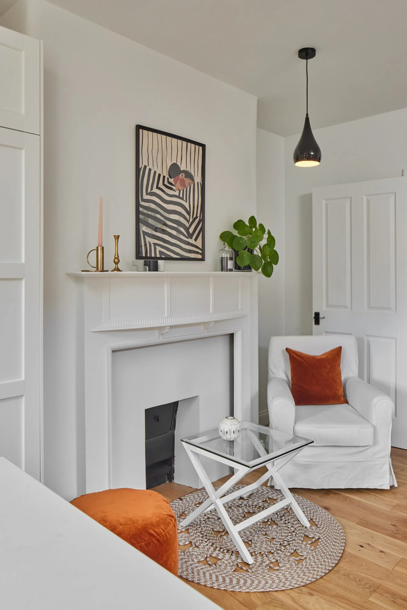
The pinks and browns in the original fireplace tiles help to inspire the look for this room. I used colour drenching in the entire property (painting the ceilings, skirtings and cornicing all the same colour) not only do I love the cocooning feel of doing this, but it also savings on the painting and decorating budget as they don’t have to do so much cutting in, brush washing and colour changing)
I loved bringing this project to completion and providing a well-designed, light and functional new home, for a family ready for a new chapter!
Design, Project Management and Staging: South Place Studio
Architect: The Architects
Photography: Juliet Murphy
Suppliers List
Bathroom Taps: ABI Interiors (Kingsley Range)
Kitchen Tap: Lusso Stone (Lambeth Single Hole Traditional Kitchen Tap Aged Bronze)
Tiles: Mandarin Stone, Claybrook, Grestec
Colourful Bedlinen: Lulu & Nat Provence / stripe bedlinen (striped side shown as curtains)
Furniture Colours:
Francesca’s Paints
Console in livingroom: Sreevidya’s Green
Red chair: Sun-dried Tomato
Bedside table bases: Pumproom Rust
Side table and standing desk: Devanandha’s Aqua
Artwork
Ceramic wall hanging and sconces: Rebecca Harker
Floral Print in hallway: Hydrangea No.1 Fine Art Print Limited Edition Sharon Simpson Studio
Wall Paint Colours:
Hallways, kitchen bathrooms: Dulux Clock Face
Primary Loft Bedroom: Dulux Heritage Green Slate
Pink Bedroom: Dulux Nutmeg White
Office: Paint & Paper Library: Sobek
Handrails: Farrow & Ball: Off Black


